

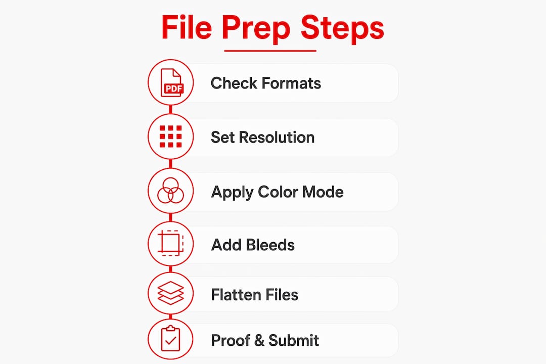
Artwork File Prep for Printing: Designer's Guide
Artwork file prep for printing is the process of building digital designs that meet strict technical criteria so they print flawlessly without any adjustments from the printer. Get it wrong and you face reprints, color shifts, and white edges where solid color should be. Get it right and your files move straight from submission to press. The core requirements cover file format, resolution, color mode, bleed, and font handling. Tools like Adobe Illustrator, Adobe InDesign, and Adobe Photoshop are the industry standard for meeting these specs. Incorrect file preparation is the most common reason for print delays and reprints. That single fact should motivate every designer and small business owner to treat prepress artwork guidelines as non-negotiable.
What file formats produce the best print-ready artwork?
The file format you submit determines how much control the printer has over your design. Choose the wrong format and fonts substitute, colors shift, and transparencies break. Choose the right one and your file arrives exactly as intended.
PDF/X is the gold standard for print-ready submissions. It embeds all fonts, enforces CMYK color mode, and flattens transparency automatically. That combination eliminates the three most common sources of printing errors in a single export step. PDF/X presets are built into Adobe Illustrator, InDesign, and Acrobat, so the barrier to using them is low.
Other accepted formats each have a specific role:
- PDF/X-1a or PDF/X-4: Best for offset and commercial printing. Use PDF/X-1a for maximum compatibility with older presses.
- AI (Adobe Illustrator): Ideal for vector logos and artwork. Keep all layers intact and include any linked files.
- PSD (Adobe Photoshop): Correct for photo-heavy or raster artwork. Flatten layers before sending unless the printer requests otherwise.
- TIFF: The preferred raster format for high-resolution images. Supports CMYK and does not use lossy compression.
- INDD (Adobe InDesign): Used for multi-page documents like brochures. Always package the file before sending.
Avoid JPEG for final print submissions. JPEG uses lossy compression that degrades image quality each time you save, and it does not support CMYK natively.
Pro Tip: When exporting a PDF from InDesign or Illustrator, select the PDF/X-1a preset, then check “Marks and Bleeds” to include crop marks and a 0.125-inch bleed in the same export.
Flattening transparency before export prevents unexpected white boxes or missing elements on press. In Illustrator, use the Flattener Preview panel to identify any transparency issues before you export. Outlining fonts converts text to vector shapes, which eliminates font substitution entirely. If you prefer to keep text editable, embed the fonts inside the PDF instead, but confirm with your printer that they accept embedded fonts.

How to set resolution, color mode, and color profiles
Resolution, color mode, and color profiles are the three technical settings that most directly affect how your printed piece looks. Mishandle any one of them and the result is a blurry image, a muddy color, or a tone that looks nothing like your screen.
Follow these steps in order when setting up any print file:
-
Set document resolution to 300 DPI at final print size. 300 DPI at the final print size is the accepted minimum for sharp, clear printed images. Upscaling a 72 DPI web image to 300 DPI in Photoshop does not add real pixel data. It only stretches existing pixels, producing a blurry result on press.
-
Convert your color mode from RGB to CMYK before submission. Converting from RGB to CMYK is critical for color accuracy. RGB is a light-based color model used by screens. CMYK is an ink-based model used by printers. Colors that look vivid on screen, especially electric blues and neon greens, often print duller in CMYK because the ink gamut is smaller than the screen gamut.
-
Assign the correct ICC color profile. For coated paper stock, use U.S. Web Coated (SWOP) v2 or GRACoL 2013. For uncoated stock, use U.S. Web Uncoated v2. These profiles tell the press exactly how to interpret your color values.
-
Use Pantone spot colors when brand accuracy is non-negotiable. Pantone colors are mixed inks, not CMYK combinations, so they reproduce consistently across every print run. Pantone 485 C is always the same red regardless of the press or paper stock.
-
Set up rich black correctly for large dark backgrounds. Rich black (C60 M40 Y40 K100) creates a deeper, more saturated black than 100% K alone. However, total ink coverage must stay within the limit for your paper stock, typically 300% for coated paper. Exceeding that limit causes smearing and slow drying.
Pro Tip: Never use rich black for small body text. The slight misregistration between ink plates makes small text look blurry. Use 100% K only for text at 12 points or smaller.
Why bleeds, trim lines, and safe zones matter
Bleeds, trim lines, and safe zones are the spatial framework that keeps your design from looking sloppy after cutting. Most designers understand them in theory but underestimate how much a 1 mm cutting variance affects the final product.
A standard bleed of 0.125 inches (3 mm) around all edges prevents white edges caused by slight cutting variations during trimming. The bleed area is not visible on the finished piece. It exists solely to give the cutter room to work without exposing unprinted paper.
| Area | Definition | Standard Size |
|---|---|---|
| Bleed | Artwork extended beyond the trim edge | 0.125 in (3 mm) on all sides |
| Trim line | The intended cut line for the final piece | Matches your document size |
| Safe zone | Inner margin keeping critical content away from the edge | 0.125 in (3 mm) inside trim |
Common mistakes that ruin otherwise good files:
- Placing a logo or phone number within 3 mm of the trim line. Even a small cut variance clips it.
- Stopping background color at the trim line instead of extending it into the bleed. This creates a white hairline on the finished edge.
- Using a white or light background that makes a hairline cut variance invisible during proofing but obvious on the printed piece.
Setting bleeds in Adobe InDesign is straightforward. Go to File > Document Setup and enter 0.125 inches in the Bleed field. In Illustrator, set the bleed in the New Document dialog or under File > Document Setup. Always confirm your printer’s bleed requirement before starting a project. Some digital printers accept 0.0625 inches (1.5 mm), while large-format printers may require more.
Best practices for fonts, images, and file organization
Font and image errors account for a large share of prepress rejections. A missing font causes the printer’s system to substitute a default typeface, which can completely change the layout. A low-resolution linked image prints blurry even if it looked sharp on screen.
The core practices that prevent these problems:
- Outline all fonts before final export. This converts text to vector paths, removing any dependency on the font file itself. The tradeoff is that outlined text is no longer editable, so always keep a working copy of the file with live text.
- Embed linked images rather than leaving them as external links. In InDesign, use the Links panel to check the status of every image. A yellow warning icon means the image is modified. A red stop icon means it is missing.
- Use only high-resolution images from the start. Sourcing a 72 DPI image from a website and placing it in your layout creates a problem you cannot fix at export. Start with images at 300 DPI or higher at the intended print size.
- Package your native files before sending. InDesign’s Package function collects the INDD file, all linked images, and all fonts into a single folder. This reduces turnaround time and lets the printer make last-minute fixes without hunting for missing assets.
Pro Tip: Use a clear file naming convention from day one. A format like ClientName_ProjectName_v3_FINAL.pdf removes any ambiguity about which file is current. Version confusion is one of the most preventable causes of printing the wrong file.
Packaging native files significantly improves communication speed with printers because all assets are bundled and ready. Sending a standalone PDF is fine for simple jobs, but for complex multi-page documents or projects with custom fonts, the packaged folder is the professional standard.
How to proof and finalize your artwork before submission
The final check before submission is where you catch the errors that slipped through every earlier stage. Skipping this step is the fastest way to approve a file that prints incorrectly.
Work through this sequence before sending any file to press:
-
Run a preflight check. Adobe Acrobat Pro, InDesign, and Illustrator all include preflight tools that scan for missing fonts, low-resolution images, RGB colors, and missing bleeds. Software preflight checks catch errors that are invisible to the naked eye during a visual review.
-
Check document size against the printer’s spec sheet. A business card submitted at 3.75 x 2.25 inches with bleed is correct. The same file submitted at 3.5 x 2 inches without bleed will be rejected or printed with white edges.
-
Verify color mode is CMYK throughout. Open the Separations Preview panel in InDesign or Acrobat to confirm no RGB objects remain in the file.
-
Review all text for spelling and alignment. Preflight tools do not catch typos. Print a physical proof or zoom to 100% on screen and read every word.
-
Approve a digital proof from the printer before production begins. Digital proof approval is critical to avoid costly reprints and production delays. A soft proof on a calibrated monitor gives you a reliable preview of how colors will reproduce on press.
“A print-ready file is one that requires zero intervention from the printer. Every adjustment the printer makes introduces a variable you did not control.” — Print production industry standard
Communicate with your printer before you start the file, not after. Ask for their template, their preferred color profile, and their bleed requirement. That five-minute conversation eliminates the most common reasons files get rejected.
Key takeaways
Print-ready artwork file preparation requires correct file format, 300 DPI resolution, CMYK color mode, proper bleed setup, and outlined or embedded fonts to reach the press without modification.
| Point | Details |
|---|---|
| Use PDF/X as your format | PDF/X embeds fonts, enforces CMYK, and flattens transparency in one export step. |
| Set 300 DPI at final size | Never upscale low-resolution images; start with high-res source files from the beginning. |
| Convert RGB to CMYK early | Color shifts happen at conversion, so convert before placing images in your layout. |
| Include 0.125-inch bleed | Extend all background colors and images beyond the trim line to prevent white edges. |
| Run preflight before sending | Use InDesign, Illustrator, or Acrobat Pro preflight tools to catch errors before submission. |
What i’ve learned from years of watching files fail at the press
The most expensive mistake I see designers and small business owners make is treating file prep as the last step instead of the first decision. By the time a file reaches the printer, every structural choice, document size, color mode, image resolution, has already been made. Trying to fix a 72 DPI image or an RGB color profile at the export stage is like repainting a car after the body panels are welded on. You can patch it, but you cannot truly fix it.
The second pattern I notice is that people send PDFs without the native files. A PDF is the right delivery format, but it is not a backup plan. If the printer finds an error, or if you need to make a last-minute change, a packaged InDesign or Illustrator folder saves hours. I always send both.
The third thing I have come to believe strongly: talk to your printer before you open a new document. Every shop has preferences. Some want PDF/X-1a. Some prefer PDF/X-4. Some have specific ICC profiles they use for their presses. A two-minute conversation at the start of a project eliminates 90% of the back-and-forth that happens at submission. The designers I respect most treat their printer as a collaborator, not a service window.
Preflight tools have gotten genuinely good in recent years. Acrobat Pro’s preflight panel, InDesign’s built-in checker, and third-party tools like Markzware FlightCheck catch problems that would have required a trained prepress technician to find a decade ago. Use them every time, without exception.
— Aaron
Handmadeohiocrafts makes custom printing simple
At Handmadeohiocrafts, every product we produce in Waverly, Ohio depends on print files that meet exact technical standards. Whether you are ordering custom sublimation tumblers or personalized apparel, the quality of your artwork file directly determines the quality of the finished product.
We work with businesses, schools, sports teams, and individuals to bring custom designs to life with no minimum order requirements. Our team reviews every file before production and will flag any issues before we print. If you want to build your artwork on a ready-made template, our gang sheet builder walks you through the exact specs we need. Explore our full catalog at Handmadeohiocrafts and get your next project started with confidence.
FAQ
What is the best file format for print-ready artwork?
PDF/X is the preferred format for print-ready artwork because it embeds fonts, enforces CMYK color mode, and flattens transparency. PDF/X-1a offers the widest press compatibility.
What resolution do i need for print files?
300 DPI at the final print size is the accepted minimum for sharp printed output. Upscaling lower-resolution images does not improve print quality.
Why does my color look different in print than on screen?
Screens use RGB, a light-based color model with a wider gamut than print. Converting to CMYK before submission reduces unexpected color shifts, but some vivid screen colors cannot be exactly reproduced with ink.
How much bleed should i add to my artwork?
A standard bleed of 0.125 inches (3 mm) on all sides is the accepted minimum. This prevents white edges from appearing if the cutter shifts slightly during trimming.
Do i need to outline fonts before sending a file to the printer?
Outlining fonts converts text to vector shapes and eliminates font substitution errors entirely. If you prefer editable text, embed the fonts inside a PDF instead and confirm your printer accepts that format.