

The Role of Artwork in Custom Printing: A Full Guide
Artwork in custom printing is defined as the precise preparation and optimization of design files to guarantee that printed products accurately reflect the original creative vision. This process, known professionally as artworking, covers everything from color profiles and resolution to bleed margins and safe zones. For artists, designers, and business owners, understanding the role of artwork in custom printing is the difference between a product that looks professional and one that disappoints. Standards like 300 PPI resolution, CMYK color mode, and a 0.125" bleed margin are not optional details. They are the foundation of every quality print.
How does artwork quality impact print accuracy?
Artwork quality directly controls how accurate and sharp your final printed product looks. Three technical factors determine this: color mode, resolution, and mechanical margins.
Color mode is the most misunderstood factor. Screens emit light using RGB (red, green, blue), while printers deposit ink using CMYK (cyan, magenta, yellow, black). Inks absorb differently than screens emit light, so a vivid blue on your monitor can print as a dull, slightly purple tone without proper conversion. Color accuracy is a core element of the artistic language in print. Protecting it requires converting files to CMYK before sending them to any printer.
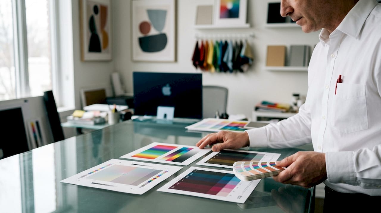
Resolution controls sharpness. The industry standard is 300 PPI at final print size. An image that looks crisp on screen at 72 PPI will print blurry and pixelated at the same size. This is one of the most common and costly mistakes designers make when moving from digital to physical output. Understanding DPI in custom printing is worth studying before you submit any file.
Mechanical margins round out the technical picture. Bleeds and safe zones protect your design from trimming errors during production.
- Bleed: Extend background colors and images 0.125" beyond the trim edge so no white border appears if the cut shifts slightly.
- Safe zone: Keep all critical text and logos at least 0.125"–0.25" inside the trim line to prevent them from being cut off.
- Trim line: The exact cut line where the finished product will be trimmed.
- Resolution: Minimum 300 PPI at 100% of the final print size.
- Color mode: Always CMYK for print, never RGB.
Pro Tip: Always request a color profile from your printer before you start designing. Different presses and substrates handle ink absorption differently, and matching your file to the printer’s profile prevents color surprises.
What are best practices for preparing artwork files for custom printing?
Proper file preparation is the single most controllable factor in print quality. Follow these steps before submitting any artwork to a printer.
-
Choose the right file format. Vector files (AI, EPS, PDF) are preferred because they scale to any size without losing quality. Raster files (JPEG, PNG, TIFF) are acceptable only when set to 300 PPI at the final print size. Specialty processes like embossing, foiling, and screen printing require vector files without exception.
-
Convert all colors to CMYK. Print requires CMYK because the physical printing process uses ink, not light. Convert your file before submission, not after. Some colors in RGB have no CMYK equivalent, and your printer’s software will make that conversion automatically, often with results you did not intend.
-
Set correct dimensions and include bleed. Build your document at the exact final print size. Add a 0.125" bleed on all sides. Place all critical design elements, including text and logos, at least 0.125" inside the trim line.
-
Embed all fonts and linked images. Fonts that are not embedded will substitute with a default typeface on the printer’s system, breaking your layout. Linked images that are not embedded will appear as missing placeholders. Outline your fonts in vector programs or embed them in PDF exports.
-
Run a preflight check. Most professional design programs include a preflight or document check function. Use it to catch missing links, wrong color modes, low-resolution images, and missing bleeds before you send the file. This step alone prevents the majority of print errors.
-
Proof on screen at 100%. Zoom your file to 100% and review every element. Check for spelling errors, alignment issues, and color inconsistencies. What you see at 100% is the closest your screen will get to the printed result.
The artwork file prep guide from Handmadeohiocrafts walks through these steps with specific examples for apparel and transfer printing, which have additional substrate considerations beyond standard paper printing.
Why is the proofing stage critical in the custom printing process?
Proofing is the last checkpoint before a print job goes to press. Skipping proofing causes expensive reprints and damages the professional relationship between client and printer. Once a job runs on press, correcting errors means starting over at full cost.
“Proof approval is a formal manufacturing contract. It signals that the client, designer, and printer have all verified the file and agreed the output is correct.”
Two types of proofs exist in professional print production. A digital proof is a high-resolution PDF or on-screen rendering that shows color, layout, and text. A physical proof (also called a press proof or hard proof) is an actual printed sample produced before the full run. Physical proofs are more expensive but give the most accurate preview of color on the specific substrate being used.
Common errors caught during proofing include:
- Text that falls outside the safe zone and risks being trimmed
- Colors that shifted during CMYK conversion
- Low-resolution images that look sharp on screen but pixelate in print
- Missing or incorrect fonts
- Bleed areas that were not extended properly
Proofing safeguards your margins and your reputation. Every stakeholder, including the client, the designer, and the printer, should sign off on a proof before production begins. This shared responsibility prevents disputes and protects everyone involved.
How can artwork influence branding and product differentiation?
Artwork is the primary vehicle for brand identity on any printed product. A well-prepared design on a custom hoodie or promotional tumbler communicates professionalism before a single word is read. Poor print quality, caused by bad artwork preparation, signals the opposite.
The impact of graphic design in custom printing goes beyond aesthetics. Consistent color across all branded products, from t-shirts to hats to tumblers, builds recognition. When your Pantone color matches across substrates, customers associate that specific shade with your brand. When it does not match, the inconsistency erodes trust.
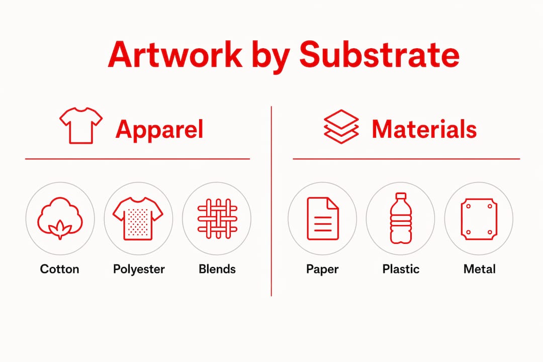
Different materials require different artwork considerations. The table below shows how substrate type affects artwork requirements.
| Substrate | Key artwork consideration |
|---|---|
| Cotton apparel (DTF) | 300 PPI raster or vector; CMYK; white underbase layer needed |
| Hard goods (laser engraving) | Vector file required; single-color grayscale artwork |
| Tumblers (sublimation) | 300 PPI; RGB color mode accepted for sublimation dye process |
| Promotional paper products | 300 PPI raster or vector; CMYK; 0.125" bleed required |
Artwork customization also drives product appeal. A sports team that prints its exact logo colors on custom crewnecks creates a product members want to wear. A nonprofit that puts a well-designed illustration on a fundraiser shirt sells more units than one with a generic clip-art design. The artwork is the product’s perceived value. Handmadeohiocrafts produces all custom apparel in-house, which means artwork adjustments happen before production, not after a bad run.
Art styles also matter for print longevity. Bold, high-contrast designs with clean lines hold up through repeated washing better than fine-detail gradients on fabric. For personalized prints meant to last, simpler artwork with strong color blocking outperforms complex photographic designs on most apparel substrates.
Key Takeaways
Artwork quality, file format, color mode, and proofing together determine whether a custom print matches the original design or falls short of it.
| Point | Details |
|---|---|
| Convert to CMYK before submission | RGB files produce unpredictable color shifts when printed; always convert to CMYK first. |
| Use 300 PPI at final size | Images below 300 PPI at print size will appear blurry and pixelated in the finished product. |
| Include 0.125" bleed | Bleed prevents white borders from appearing if the trim cut shifts during production. |
| Proof before every print run | Proofing catches color shifts, text errors, and layout problems before costly press runs begin. |
| Match artwork to substrate | Different materials like fabric, metal, and paper each require specific file types and color settings. |
Aaron’s take on artwork and the prints that actually hold up
The biggest mistake I see from designers moving into custom print production is treating the screen as the final product. It is not. The screen is a preview. The substrate is the product. That shift in thinking changes everything about how you prepare a file.
I have watched talented artists submit gorgeous RGB designs and then be genuinely confused when the printed shirt came back looking flat and muddy. The artwork was not wrong. The preparation was. Designs created for screen display rarely match printed output without proper artworking. That is not a flaw in the printing process. It is a physics problem. Ink on fabric and light on glass are two completely different mediums.
The other thing I would push back on is the idea that proofing slows you down. Proofing is the fastest path to a correct print. Every time someone skips it to save a day, they lose a week to reprints and revisions. Build proofing into your workflow as a fixed step, not an optional one.
For businesses using custom products as branding tools, the artwork investment pays back directly in perceived quality. A well-printed logo on a custom tumbler or hoodie does more for brand recognition than most paid advertising. Get the file right, and the product does the work for you.
— Aaron
Handmadeohiocrafts custom printing and artwork support
Handmadeohiocrafts handles custom apparel, DTF transfers, laser engraving, tumblers, and promotional products entirely in-house from its Waverly, Ohio facility. That means artwork gets reviewed and adjusted before production starts, not after a bad run ships.
For artists and businesses ready to put their designs on physical products, the DTF transfers service accepts vector and high-resolution raster files and includes artwork setup guidance for every order. The DTF file requirements page covers exact specs for color mode, resolution, and bleed so your files are print-ready before submission. No minimum order requirements and nationwide shipping make it practical for single orders and bulk runs alike.
FAQ
What does “artworking” mean in custom printing?
Artworking is the professional process of preparing a design file to meet the technical requirements of a specific print process. It includes setting correct resolution, color mode, bleed margins, and file format before production begins.
Why does my design look different printed than on screen?
Screens use RGB light to display color, while printers use CMYK ink on physical substrates. Color reproduction differs between the two mediums, so RGB files must be converted to CMYK and proofed before printing to avoid unexpected color shifts.
What file format is best for custom printing?
Vector files in AI, EPS, or PDF format are the best choice because they scale without quality loss. Raster files like PNG or TIFF are acceptable only when set to 300 PPI at the final print size.
What is a bleed and why does it matter?
A bleed is an extension of your background color or image 0.125" beyond the trim edge of your design. It prevents white borders from appearing if the cutting machine shifts slightly during production.
Can I skip proofing if I have printed the design before?
Proofing should happen for every new print run, even for repeat designs. Substrate batches, ink levels, and press calibration change between runs, and proofing catches errors that would otherwise result in costly reprints.