

Color Separation Printing: A Technical Guide for Print Pros
Color separation printing is the process of breaking a full-color image into individual single-color layers, each printed separately to reconstruct the original artwork on press. Every commercial print job you see, from a cereal box to a concert poster to a branded hoodie, gets there through this process. The artwork is decomposed into its component inks, typically cyan, magenta, yellow, and black (CMYK), and sometimes additional spot colors. Each component becomes its own plate, and those plates print in sequence to rebuild the image one layer at a time.
The core purpose is control. Printing all colors simultaneously from a single source is physically impossible with ink on substrate. Separation gives you discrete, manageable layers that a press can handle one at a time, in precise registration, to produce accurate color.
Here is what color separation printing covers in practice:
- CMYK process separations for full-color photographic and illustrated work
- Spot color separations for brand-specific colors, metallics, and fluorescents
- Film or plate output for offset lithography, screen printing, and flexography
- Digital prepress workflows that replaced analog film-based methods
- Applications across packaging, publishing, textile printing, and promotional products
Table of Contents
- How color separation printing evolved from darkroom to desktop
- Why CMYK and spot colors serve different jobs in color separation
- The print physics that every color separation decision rests on
- How plate accuracy and press registration determine final print quality
- Expert insights from Handmadeohiocrafts on getting print projects right
- Key Takeaways
How color separation printing evolved from darkroom to desktop
The shift from analog to digital color separation is one of the most consequential changes in commercial printing history. Understanding both tells you why modern digital workflows demand such precision.
1. Analog separation using photographic filters
Traditional color separation was a photographic process: a camera photographed the original artwork three times, each time through a different color filter (red, green, blue). Each exposure captured the image’s response to that wavelength, producing three grayscale film negatives. Those negatives were then inverted to create the cyan, magenta, and yellow separations, since each is the photographic complement of its corresponding RGB filter. Black was derived separately using techniques like gray component replacement or under color removal.
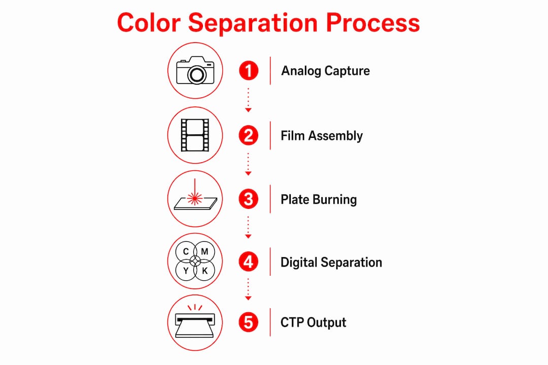
2. Film assembly and plate burning
Each separation negative was used to expose a printing plate, typically aluminum in offset lithography. The plate carried a light-sensitive coating that hardened where light struck it, creating an ink-receptive image area. This step required meticulous alignment; any shift between plates meant color fringing on press.
3. The digital transition
Today, color separation is almost exclusively digital. A scanner or digital camera captures the original image as RGB data, and prepress software converts it to CMYK (or adds spot channels) through color management profiles. There is no manual film splicing, no darkroom, and no filter swapping. That convenience comes with a trade-off: the precision that a skilled analog separator could apply by hand now has to be built into the file itself.

4. Software-driven separation
Adobe Photoshop, Illustrator, and InDesign handle the bulk of separation work in most U.S. print shops. Photoshop’s color settings panel controls the ICC profile used for CMYK conversion, which determines how RGB values map to ink percentages. RIP (Raster Image Processor) software then translates those separations into plate-ready output.
5. Computer-to-plate (CTP) output
Modern offset shops use CTP systems that write the separation data directly onto aluminum plates with a laser, skipping film entirely. This removes one generation of image transfer and tightens registration tolerances.
Pro Tip: Before sending files to any printer, use your software’s separation preview panel to check each channel individually. A color that looks correct in RGB composite view can reveal blown-out ink values or missing spot channels the moment you isolate it.
Why CMYK and spot colors serve different jobs in color separation
CMYK is the workhorse of four-color process printing, but it has a ceiling. The gamut of cyan, magenta, yellow, and black inks covers a wide range of hues, but it cannot reproduce every color a designer can create on screen, and it cannot match brand colors with the consistency that corporate identity standards demand.
Where CMYK works well:
- Full-color photography and illustrations with gradients and tonal variation
- Packaging and publishing where photographic fidelity matters more than exact spot matching
- Jobs where cost efficiency outweighs color precision
Where CMYK falls short:
- Exact brand colors (a specific Pantone red that shifts orange in CMYK)
- Metallic inks, fluorescents, and pastels that fall outside the CMYK gamut
- Large solid areas of a single color where CMYK dot patterns become visible
The Pantone Matching System (PMS) is the industry standard for specifying spot colors. Each Pantone number corresponds to a premixed ink formula, so a Pantone 485 red printed in Ohio and in California will match, regardless of press or paper stock. Spot colors require their own separation channel and their own plate on press, which adds cost but delivers consistency CMYK cannot.
When a job calls for both process and spot colors, the separation file carries five or more channels: the four CMYK channels plus one channel per spot color. Screen printers working on fabric substrates deal with this constantly, since each color in a design requires a separate screen and a separate pass through the press.
The print physics that every color separation decision rests on
Ink on paper works through subtractive color mixing, not additive. Each ink absorbs (subtracts) certain wavelengths of light and reflects others. Cyan absorbs red, magenta absorbs green, yellow absorbs blue. Layered together, they subtract most visible light, producing near-black. This is the opposite of how your monitor works, which adds red, green, and blue light to produce color.
One consequence of subtractive mixing is absolute: white cannot be produced by any combination of CMYK inks. White in a print design is always the substrate showing through. On coated white paper, that works fine. On kraft board or a colored garment, white elements disappear or shift unless you add a dedicated white ink as a separate separation.
Halftoning is how printing simulates continuous tones. A press applies ink at full density or not at all; it cannot vary ink concentration mid-print. To create the appearance of a light blue, the cyan plate prints tiny dots at a low percentage, letting the white substrate show between them. The eye blends the dots into a tone. Dot size and spacing are controlled by the halftone screen frequency, measured in lines per inch (lpi).
Moiré patterns are the visual interference that appears when halftone screens from different separations overlap at wrong angles. The standard solution is to assign each CMYK channel a specific screen angle: 45°, 75°, 90°, and 105° are the conventional values. Black typically runs at 45° because the eye is least sensitive to dot patterns at that angle.
Total Area Coverage (TAC) is the sum of all four CMYK ink percentages at any given point. A shadow area with 100% cyan, 100% magenta, 100% yellow, and 100% black has a TAC of 400%, which is too much ink for most presses to dry properly. Most offset printing processes recommend keeping total ink coverage below a certain threshold to prevent smearing, slow drying, and ink set-off on the sheet above.
How plate accuracy and press registration determine final print quality
Print quality depends critically on separation accuracy, plate production, and registration. A flawless digital file can still produce a bad print if the plate is exposed incorrectly or the press operator cannot hold tight registration.
Key practices that protect quality:
- Registration marks are printed outside the live area on every separation. Press operators align these marks to confirm all plates are in the correct position before the full run begins.
- Color bars run along the sheet edge and let operators measure ink density with a densitometer, catching ink starvation or flooding before it ruins thousands of sheets.
- Trapping adds a slight overlap between adjacent colors to prevent white gaps from appearing if plates shift slightly on press. A typical trap value is 0.25–0.5 points, set in the prepress file or by the RIP.
- Overprinting black text rather than knocking it out prevents the white halo that appears when small type misregisters by even a fraction of a point. Black text set to overprint sits on top of whatever color is beneath it, so a slight shift leaves no gap.
For artwork file preparation, always supply files with bleed, correct color mode, and separation previews confirmed before sending to press. Misregistration on press is often blamed on the printer, but the root cause is frequently a file that was never checked for overprint settings or trap values.
Expert insights from Handmadeohiocrafts on getting print projects right
At Handmadeohiocrafts, the team works with designers, businesses, and sports teams daily on custom apparel and promotional products that demand accurate color reproduction. A few patterns show up repeatedly in projects that go wrong.
The most common file issue is total ink coverage in dark areas. Designers building in RGB often have no idea what their shadows look like in CMYK until the file is converted. A rich black built from 100C/100M/100Y/100K looks fine on screen and prints as a muddy, slow-drying mess. A standard rich black of 60C/40M/40Y/100K stays well within TAC limits and prints clean.
Separation preview is the single most useful tool most designers never open. In Adobe Illustrator or InDesign, the Separations Preview panel shows you exactly what each plate will look like before the file leaves your desk. Spot colors that were accidentally converted to CMYK show up immediately. Unintended white knockouts in black text are visible in seconds.
Pro Tip: When collaborating with a printer, ask for a hard-copy proof on the actual substrate before approving a full run. A monitor-calibrated soft proof is useful, but substrate color, coating, and ink absorption all affect the final result in ways a screen cannot fully predict.
Proofing is not optional for brand-critical work. For full-color print jobs, a contract proof matched to the press profile gives you a legally binding color target the press operator works to match. That one step eliminates most color disputes before they start.
Key Takeaways
Color separation printing converts full-color artwork into discrete ink layers, each requiring its own plate and precise press registration to accurately reconstruct the original design.
| Point | Details |
|---|---|
| CMYK covers most, not all, colors | Spot colors like Pantone inks are needed for brand colors, metallics, and fluorescents outside the CMYK gamut. |
| TAC limits prevent press failures | Keep total ink coverage at 300%–320% maximum to avoid smearing and drying problems on press. |
| White comes from the substrate | No CMYK ink combination produces white; substrate color determines how light areas and white elements appear. |
| Screen angles prevent moiré | Standard CMYK angles of 45°, 75°, 90°, and 105° keep halftone patterns from interfering with each other. |
| Overprint black text | Setting black type to overprint rather than knockout prevents white gaps caused by slight press misregistration. |